Code an app that will take screenshots from website URLs 🔥📸

A passionate front-end developer from India.
Hello there, I'm Sanvi Merin. I'm really passionate about web development. I have prooved my excellence in frontend web development. I love sharing my tech ideas and tutorials with communities.
I was wondering what to build for #christmashackathon on @hashnode Then I got a superb idea that could cause a revolution and save our lot of time.
The Idea
I'm gonna build an App that could take a screenshot of a website from an input field and put that screenshot in a web browser mockup. The user could determine the background colour and all. Also, the screenshot has a shadow that makes it more pleasant. Users could easily download it by clicking the download button.
It will save a lot of time. Without this, a user should take a screenshot himself, crop it, resize it, download a mockup, attach the screenshot with the mockup, add shadows, add a background colour. A lot of mess isn't it??
Our App makes the work easier. It does all the above-mentioned things in a matter of seconds and thus saves a lot of precious time. ⏳
Let's Code

Now it is time to start coding our app. Our app is fully a frontend project. Here is the file tree of our App 👇
root/
├── index.html
├── style.css
└── index.js
As everyone knows index.html act as the homepage and style.css is being used to add our CSS styling. All our work process take place inside index.js In this project we are not gonna use additional libraries. We are gonna code everything from scratch. We are only using a screenshot API developed by premieroctet. This is how the API call will look like 👇
https://2s9e3bif52.execute-api.eu-central-1.amazonaws.com/production/screenshot?url={website_url}&color={color}
Ok then, now let's start with index.html It has 3 sections.
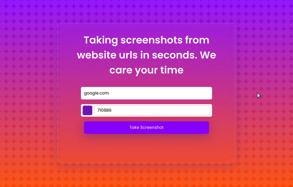
The first section will act as the homepage where one could write the website address

The second section will work as the loader which gives enough time for
APIto work and make the UI more effective.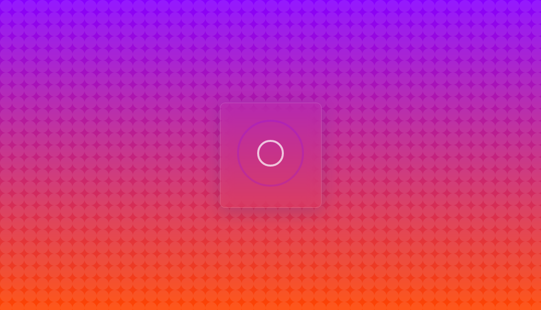
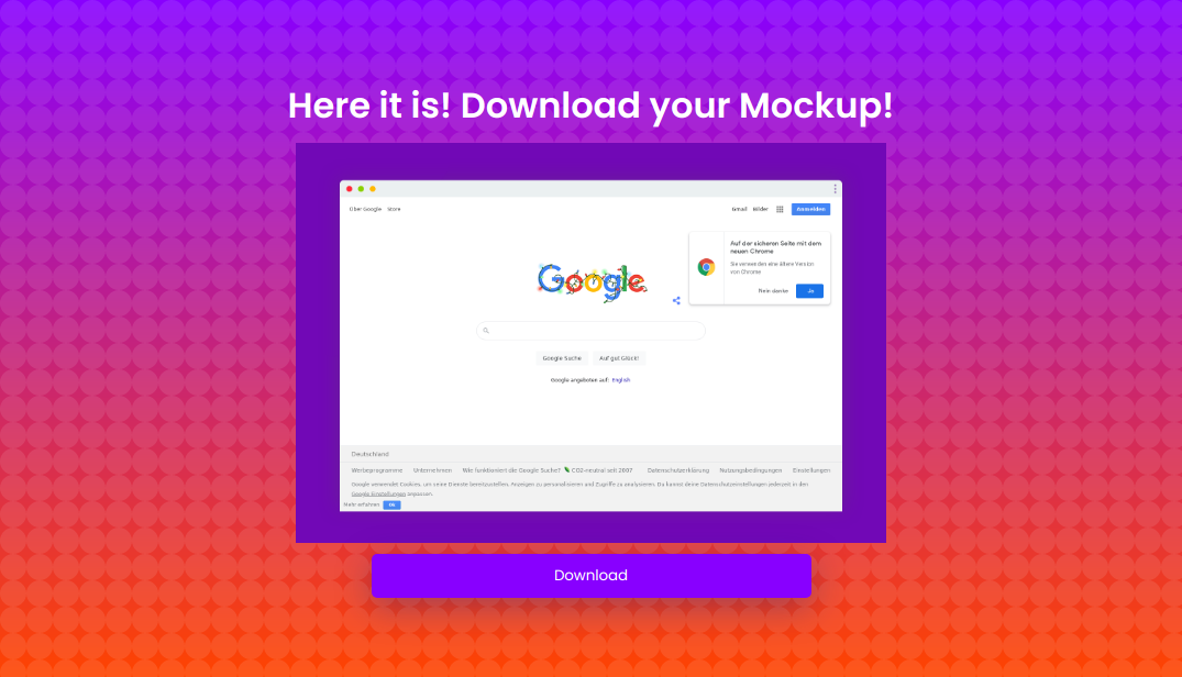
The third section will show the screenshot taken and have a button where the user could download the screenshot
Here is how the index.html gonna look like 👇
<!DOCTYPE html>
<html lang="en">
<head>
<meta charset="UTF-8">
<meta name="viewport" content="width=device-width, initial-scale=1.0">
<title>Taking screenshots from website urls in seconds</title>
<link rel="stylesheet" href="style.css">
</head>
<body>
<section id="section1">
<h1>Taking screenshots from website urls in seconds. We care your time</h1>
<div class="cont">
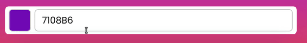
<input type="text" id="websiteAdress" value='google.com'>
<div class="color_cont">
<div id="color_demo"></div>
<input type="text" id="bgColor" value='7108B6'>
</div>
<button type="submit" id="submitBtn" onclick='generateMockup();changeView()'>Take Screenshot</button>
</div>
</section>
<div id="section2">
<div class="wrapper">
<div class="loadingio-spinner-ripple-4o61jz917vh">
<div class="ldio-tnoicgfz6f">
<div></div>
<div></div>
</div>
</div>
</div>
</div>
<div id="section3">
<div class="cont">
<h1>Here it is! Download your Mockup!</h1>
<img alt="" id='resultImg'>
<button id="Download">Download</button>
</a>
</div>
</div>
<script src="index.js"></script>
</body>
</html>
The things we need to consider are
inputfor the website URLs has given the idwebsiteAdressinputfor the website background colour has given the idbgColorimgfor the final result has given the idresultImgbuttonto download the final result has given the idDownloadsection1,section2,section3are given theidrespectively.
Now let's talk about the style.css As I said earlier style.css is just the CSS styles that work to get the App UI. I have kept it simple yet good. It totally depends on you. You could code the styles as per your wish. 🦄
Here are the common styles
@import url("https://fonts.googleapis.com/css2?family=Poppins:wght@400;500;600&display=swap");
* {
  margin: 0;
  font-family: "Poppins", sans-serif;
  padding: 0;
}
body {
  min-height: 100vh;
  width: 100%;
  background-color: #ffffff;
  background-image: url("data:image/svg+xml,%3Csvg xmlns='http://www.w3.org/2000/svg' width='100%25' height='100%25' %3E%3Cdefs%3E%3ClinearGradient id='a' x1='0' x2='0' y1='0' y2='1'%3E%3Cstop offset='0' stop-color='%2380F'/%3E%3Cstop offset='1' stop-color='%23f40'/%3E%3C/linearGradient%3E%3C/defs%3E%3Cpattern id='b' width='24' height='24' patternUnits='userSpaceOnUse'%3E%3Ccircle fill='%23ffffff' cx='12' cy='12' r='12'/%3E%3C/pattern%3E%3Crect width='100%25' height='100%25' fill='url(%23a)'/%3E%3Crect width='100%25' height='100%25' fill='url(%23b)' fill-opacity='0.1'/%3E%3C/svg%3E");
  background-attachment: fixed;
  background-size: cover;
  color: #fff;
  display: flex;
  align-items: center;
  justify-content: center;
}
input {
  padding: 0 10px;
  outline: none;
}
Here is the style for section1 👇
/* Section 1 */

#section1 {
  background: rgba(255, 255, 255, 0);
  box-shadow: 0 8px 32px 0 rgba(31, 38, 135, 0.2);
  backdrop-filter: blur(12.5px);
  -webkit-backdrop-filter: blur(12.5px);
  border-radius: 10px;
  border: 1px solid rgba(255, 255, 255, 0.18);

  width: 60%;
  height: 28em;
  text-align: center;
  /* display: none; */
  align-items: center;
  flex-direction: column;
  justify-content: center;
}

#section1 h1 {
  font-size: 2em;
  padding: 30px;
}

#websiteAdress {
  height: 40px;
  width: 400px;
  border-radius: 5px;
  border: none;
  margin: 0 0 15px 0;
}
.color_cont {
  height: 40px;
  width: 420px;
  background: #fff;
  border-radius: 5px;
  border: none;
  display: flex;
  align-items: center;
  justify-content: flex-start;
  margin: 0 0 15px 0;
}
#color_demo {
  width: 30px;
  height: 30px;
  border: 1px solid #ccc;
  border-radius: 5px;
  background: #7108b6;
  height: 30px;
  margin: 0 5px;
}
.color_cont input {
  height: 30px;
  width: 350px;
  border-radius: 5px;
  border: 1px solid #ccc;
}
button {
  height: 40px;
  width: 400px;
  border-radius: 5px;
  background: #8800ff;
  color: #fff;
  background-blend-mode: screen, color-dodge, overlay, difference, normal;
  border: none;
  box-shadow: 0 8px 32px 0 rgba(31, 38, 135, 0.37);
  cursor: pointer;
}
The second section has a loader inside it. So here is the style for section2 👇
/* Section 2 */
#section2 {
  display: none;
}

.wrapper {
  background: rgba(255, 255, 255, 0);
  box-shadow: 0 8px 32px 0 rgba(31, 38, 135, 0.2);
  backdrop-filter: blur(12.5px);
  -webkit-backdrop-filter: blur(12.5px);
  border-radius: 10px;
  border: 1px solid rgba(255, 255, 255, 0.18);
}
@keyframes ldio-tnoicgfz6f {
  0% {
    top: 96px;
    left: 96px;
    width: 0;
    height: 0;
    opacity: 1;
  }
  100% {
    top: 18px;
    left: 18px;
    width: 156px;
    height: 156px;
    opacity: 0;
  }
}

.ldio-tnoicgfz6f div {
  position: absolute;
  border-width: 4px;
  border-style: solid;
  opacity: 1;
  border-radius: 50%;
  animation: ldio-tnoicgfz6f 1s cubic-bezier(0, 0.2, 0.8, 1) infinite;
}

.ldio-tnoicgfz6f div:nth-child(1) {
  border-color: #ffffff;
}

.ldio-tnoicgfz6f div:nth-child(2) {
  border-color: #8800ff;
  animation-delay: -0.5s;
}

.loadingio-spinner-ripple-4o61jz917vh {
  width: 200px;
  height: 200px;
  display: inline-block;
  overflow: hidden;
}
.ldio-tnoicgfz6f {
  width: 100%;
  height: 100%;
  position: relative;
  transform: translateZ(0) scale(1);
  backface-visibility: hidden;
  transform-origin: 0 0; /* see note above */
}
.ldio-tnoicgfz6f div {
  box-sizing: content-box;
}
Here is the style for section3 👇
/* Section 3 */
#section3 {
  display: none;
  align-items: center;
  justify-content: center;
  text-align: center;
  flex-direction: column;
}
#resultImg {
  width: 50%;
  margin: 10px;
}
.cont {
  display: flex;
  align-items: center;
  justify-content: center;
  flex-direction: column;
}
Now, let's jump on to index.js. These are the functions that the index.js does
change colour to show the user the preview on the typed colour
Make the mockup
- Preview the mockup as the src of
<img>in thesection3 - Download the mockup on button click
- Change the section according to the time. First it will be
section1, then it will disappear and thesection2loader takes the place and then it goes andsection3gives the mockup.
Ok then, let's start!! 💻
First, we can go initialise some of our components. We could initialise others in the respective functions
const section1 = document.getElementById("section1");
const section2 = document.getElementById("section2");
const section3 = document.getElementById("section3");
const resultImg = document.getElementById("resultImg");
const Download = document.getElementById("Download");

const submitBtn = document.getElementById("submitBtn");
After that, let's go create our first function that is changing colour to show the user the preview on the typed colour. Here goes the code 👇
const changeColor = () => {
  const bgColor = document.getElementById("bgColor").value;
  const color_demo = document.getElementById("color_demo");

  color_demo.style.background = "#" + bgColor;
};

bgColor.addEventListener("input", changeColor);
bgColor.addEventListener("propertychange", changeColor);
Ok then, our next step, the most important step is to create the mockup and preview the mockup on the section3. Here goes the code 👇
const generateMockup = () => {
  const websiteAdress = document.getElementById("websiteAdress").value;
  const bgColor = document.getElementById("bgColor").value;
  const mockup =
    "https://2s9e3bif52.execute-api.eu-central-1.amazonaws.com/production/screenshot?url=" +
    websiteAdress +
    "&color=" +
    bgColor;
  console.log(mockup);
  resultImg.src = mockup;

  section1.style.display = "none";
  section2.style.display = "block";

  Download.addEventListener("click", function () {
    window.open(mockup);
  });
};
Ok then, now let's code our last step that is to Change the section according to the time. Here goes the code for that 👇
const changeView = () => {
  setTimeout(() => {
    section2.style.display = "none";
    section3.style.display = "block";
  }, 6500);
};
 Oh yeah, that's it we have finished our project, let's go test it 📸
Click here to view the full code on Github 🤘
Click here to view the live demo 🚀
Yay, We did it. Pretty easy right, Thanks to everyone for being with me and coding along. If you liked this article go support me by adding some cool reactions. Also, add some comments and share it with your friends. 🤩🥳
Follow me on Twiiter and Github


